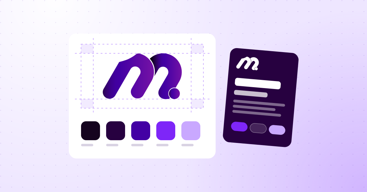
How to create a visual identity.
Creating a visual identity means defining how the brand appears everywhere: logo, colors, typography, images and the way to combine all of it. The work starts with strategy, moves through design, is tested in real situations and ends in a set of brand guidelines.
 Fabrício Martins
Founder of Martin Marketing & Design

In short
- What it is: the brand’s visual system, and not just the logo.
- Where it starts: with positioning: who the brand speaks to and what it wants to convey.
- What it is made of: logo, colors, typography, supporting elements and image style.
- How it ends: with tests in real use and brand guidelines.
What a visual identity is
A visual identity is the set of elements that makes a brand recognizable even before anyone reads the name. The logo is the best-known part, but it is only one piece.
| Term | What it is | Example |
|---|---|---|
| Logo | The mark that signs the brand | The symbol and the name as drawn |
| Visual identity | The complete system of appearance | Logo, colors, type, icons and photos |
| Branding | Managing how the brand is perceived | Positioning, tone of voice, experience and identity |
A company can have a beautiful logo and a weak identity. It happens when the business card, the website and Instagram use the same logo and, apart from that, look like different companies. The identity is what ties everything together.
Before the design: the strategy
A visual identity born from the owner’s personal taste ages fast. One born from a positioning decision lasts for years. Before opening any design software, answer in writing:
- Who does the brand speak to? The ideal customer, with age, context and what they value.
- What does the brand solve? In one sentence, with no jargon.
- Why choose you and not the competitor? The real differentiator, not the desired one.
- How does the brand behave? Three or four adjectives: serious, approachable, bold, technical.
- What are the competitors like? Colors, styles and promises that are already taken.
The last question avoids an expensive mistake. If every clinic in your area uses blue and green, one more blue and green brand disappears in the crowd. If every firm uses golden serifs, the same device sets nobody apart.
A good test: do the answers fit any company in the industry? If they do, there is no positioning yet, and the design will come out generic.
From positioning to references
With the strategy written down, the next step is to translate words into images. The tool is the mood board: a collection of images that shows the feel of the brand.
- Brands from other industries that convey the same feeling.
- Color palettes, textures and materials.
- Lettering styles.
- Photographs with the light and the framing that match.
The board is not for copying. It is for aligning. Saying "I want something modern" does not mean the same thing to two people. Pointing at three images settles in a minute what a whole meeting cannot.
It is worth building two or three different routes and choosing one before designing. Changing direction at this stage costs an afternoon. Changing after the logo is ready costs the project.
The logo
The logo is the signature. There are three main formats:
- Wordmark. Just the letters, with a design of their own. It works well for short, striking names.
- Symbol and name. The most versatile: the symbol can be used alone when space is small.
- Monogram. The initials. Useful for long or compound names.
Whatever the format, a good logo meets five criteria:
- It is simple. You can draw it from memory after seeing it twice.
- It works small. It stays legible at the size of an app icon.
- It works in a single color. Without depending on a gradient or a shadow.
- It is different from its neighbors. It is not confused with the direct competitor.
- It relates to the strategy. Every choice has a reason that can be explained.
Be wary of the logo that needs a long explanation to make sense. The end customer will never read the explanation.
The colors
Color is the element the eye recognizes fastest. A well-built palette has few colors and a defined role for each one:
| Role | How many | Where it appears |
|---|---|---|
| Primary color | 1 | Logo, buttons and highlights |
| Supporting colors | 1 or 2 | Charts, illustrations and details |
| Neutrals | 2 or 3 | Backgrounds and text |
Three points of care when choosing:
- Contrast. The text needs to be legible over the background. A beautiful color nobody can read is no use.
- Real use. The color needs to work on screen and on paper. Very vibrant tones on screen usually lose strength in print.
- Proportion. The primary color does not need to cover everything. Used in the right spots, over a neutral base, it draws more attention.
Record each color with its codes for screen and for print. It is the first item in a set of brand guidelines.
The typography
Letters say a lot about the brand before any word is read. A clean, geometric typeface conveys one feeling. A classic serif conveys another.
In practice, two families solve almost everything:
- One for headings. With more personality. It is where the brand shows.
- One for body text. Neutral and very legible, in several weights.
Before deciding, check three points. Does the font have every accent and character your languages need? Does the license allow commercial use, on the website and in printed materials? And is there a similar alternative for when the official font is not available, as in presentations and emails?
The license is the most forgotten point. A font downloaded from a free site without checking the terms can become a problem when the brand grows.
The supporting elements
Logo, color and type form the foundation. What brings the brand to life day to day are the supporting elements:
- Graphic devices. Shapes derived from the logo, used as a background, frame or detail.
- Icons. A set with the same stroke and the same weight.
- Photography style. Light, framing and type of scene. Generic stock photos weaken any brand.
- Illustration. When it makes sense, with a single style.
- Templates. Post, presentation, proposal and email signature already built.
It is this layer that makes a piece recognizable as the brand’s even without the logo. Cover the signature on one of your ads: can you tell whose it is?
Test in real use before approving
An identity approved in a beautiful presentation can fail on first use. Before signing off, apply the brand to the situations it will face:
- Social media profile picture. A small circle. Does the symbol survive?
- Site icon. The smallest version, in the browser tab.
- A single color. Stamp, embroidery, invoice.
- Light background and dark background. With a version for both.
- Over a photo. Is it still legible?
- Large. Storefront, banner, trade show booth.
- Next to the competitors. Put the logos side by side. Does yours stand out or blend in?
Every flaw found here is an adjustment of minutes. The same flaw found after printing a thousand business cards is a loss.
An example: from strategy to design
To see the method at work, imagine an accounting firm that serves small businesses. It is a hypothetical case, but the reasoning applies to any industry.
The strategy. The audience is small business owners who find accounting complicated and are afraid to ask. The firm’s differentiator is explaining everything in plain language. The adjectives chosen: approachable, clear, trustworthy.
The competition. Almost every firm in the area uses navy blue, serif type and symbols of charts or columns. The set conveys seriousness and also distance, exactly what the audience fears.
The decisions. Instead of the industry’s blue, a warm color as the primary, over a neutral base. Instead of the formal serif, a rounded, very legible typeface. Instead of the chart, a simple symbol that suggests a speech bubble. Each choice answers to an adjective from the strategy.
The test. Side by side with the competitors, the brand stands out without looking less serious. In the phone icon, the symbol stays legible. In a single color, it works on the stamp.
Notice that no decision started from "I like orange". All of them started from who the brand speaks to and what it wants to convey.
Do it yourself, use a tool or hire someone
| Path | When it makes sense | Limitation |
|---|---|---|
| Doing it yourself | A business being validated, with no budget | A generic result that is hard to evolve |
| Automatic generator or ready-made template | A temporary project or an idea test | The same template is used by many other companies |
| Designer or studio | A company that already sells and wants to be recognized | Requires investment and taking part in the decisions |
No path is wrong. The mistake is staying on the first one when the company has already moved to another stage. An improvised brand costs little at the start and charges later, in every piece redone and in every customer who does not take the company seriously.
When hiring, what influences the investment is the scope: only the logo or the complete system, how many applications, whether it includes the guidelines and whether there is research and strategy before the design.
What you should receive at the end
- Logo in every version: primary, horizontal, vertical, symbol and single color.
- Files in vector and in image format, for screen and for print.
- Palette with the codes for each color.
- Recommended fonts, with the licenses or the official links.
- Supporting elements and ready-made templates for day-to-day use.
- Brand guidelines with the rules and the incorrect uses.
- Ownership of everything, recorded in the contract.
The last item deserves attention. The editable files and the usage rights need to be yours. A brand only the provider can edit is not a delivered brand.
Common mistakes
- Starting with the design. Without strategy, the choice becomes a matter of taste.
- Following the trend. The style of the year ages along with the year.
- Deciding by committee. Ten opinions produce a brand with no opinion.
- Using too many colors. The more colors, the harder it is to stay consistent.
- Ignoring the small size. Most people will see the brand on a phone screen.
- Not documenting. Without guidelines, the identity falls apart in a few months.
Frequently asked questions
No. The logo is the brand’s signature. The visual identity is the whole system: logo, colors, typography, graphic elements and image style. You can have a logo without an identity, but the brand is only truly recognized when the whole system is used the same way.
You can use it to explore ideas and gather references. For the final result, there are limits: the design can come out similar to brands that already exist, the files do not always come in vector format and the tool does not ask the strategy questions. The safest approach is to treat it as a starting point, not as the deliverable.
Registration with INPI, Brazil’s trademark office, is what secures the exclusive right to use the name and the mark in your line of business. It is worth checking availability before creating the identity, so you do not invest in a name that already has an owner. For the process itself, look for an intellectual property professional.
Few. One primary color, one or two supporting colors and the neutrals for background and text solve most cases. Brands with many colors are harder to apply consistently and easier to confuse.
It is almost never the design. What delays it is the decision: many people giving opinions with no final decision-maker, taking too long to choose between the routes presented and changes of direction after approval. Defining who decides, before starting, shortens the project by weeks.
Conclusion
Creating a visual identity means making business decisions and translating them into shape, color and type. The order matters: strategy, references, design, test and documentation.
Done this way, the brand stops being a file and becomes a sales tool. If you want to walk this path with someone who does it every month, get to know Martin’s branding and visual identity work.